Why Your Photography Website Isn’t Getting Inquiries (And How to Fix It)
Most photography websites fail to generate inquiries not because of poor photos but because of poor strategy. This guide breaks down the real reasons photographer websites go quiet and exactly how to fix each one.
Your photography website is probably quiet because it was built to look good, not to convert. The photos might be stunning. But if the copy doesn’t speak to your client, the layout doesn’t guide them, and there’s no clear path to booking, visitors leave without reaching out. Every issue on this list has a fix, and none of them require starting over from scratch.
You have the talent. You put up a website. And still, the inbox is quiet.
The frustrating part is watching other photographers in your market book out months in advance when your work is just as good. So what are they doing differently?
Most of the time, the answer isn’t talent and it isn’t price. It’s the website. More specifically, it’s what the website is built to do.
A photography portfolio shows work. A photography website that converts clients is built differently, and most photographers have the first one when they need the second.
Here’s what’s actually causing the silence.
Your website is built like a gallery, not a funnel
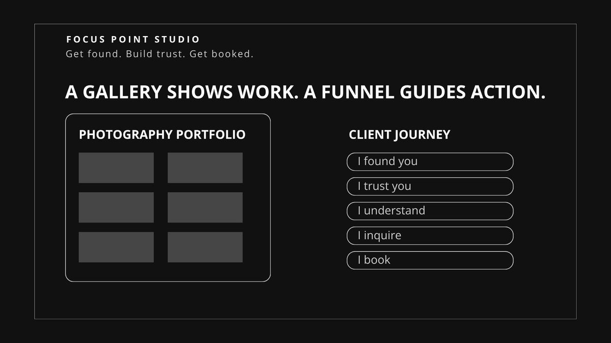
A gallery is passive. It sits there looking beautiful and waits for someone to decide on their own.
A funnel is active. It takes a visitor from “I found you” to “I want to book you” by anticipating what they need at each step and showing it to them in the right order.
Most photographer websites are beautiful galleries. The photos are stunning. But there’s no copy that speaks to the client. No layout designed to answer their questions. No path to taking the next step.
As Fstoppers puts it: “Your website is built like an art gallery when it should be built like a sales funnel.” Source: Fstoppers
The fix: Think about what your ideal client needs to see, feel, and understand before they’re ready to reach out. Build your website to deliver each of those things in order, before the contact form.
Your copy talks about you, not your client
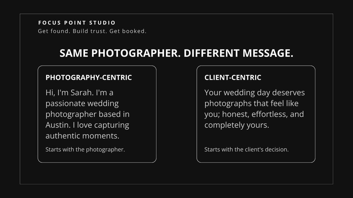
Read the first sentence on your homepage out loud. Does it talk about who you are, or about what your client gets?
Most photographer copy starts with some version of: “Hi, I’m [Name]. I’m a [city] photographer passionate about capturing authentic moments.”
That sentence has nothing in it for the client. It doesn’t tell them whether you’re the right fit. It doesn’t address what they’re worried about or hoping for. It just introduces you.
Your copy should start where your client’s mind already is. What are they trying to preserve? What are they nervous about? What do they need to believe before they trust someone with one of the most important days of their life?
Photographers who consistently book premium clients write copy that makes the reader feel understood before a single word has been exchanged. That’s not an accident. It’s a deliberate choice.
The fix: Rewrite your homepage headline to speak directly to your ideal client’s desire or fear. “Beautiful photos” is not a headline. “You only get one chance to capture this” is.
Want to audit your own site? Download our free Website Checklist for Photographers.
There’s no clear next step
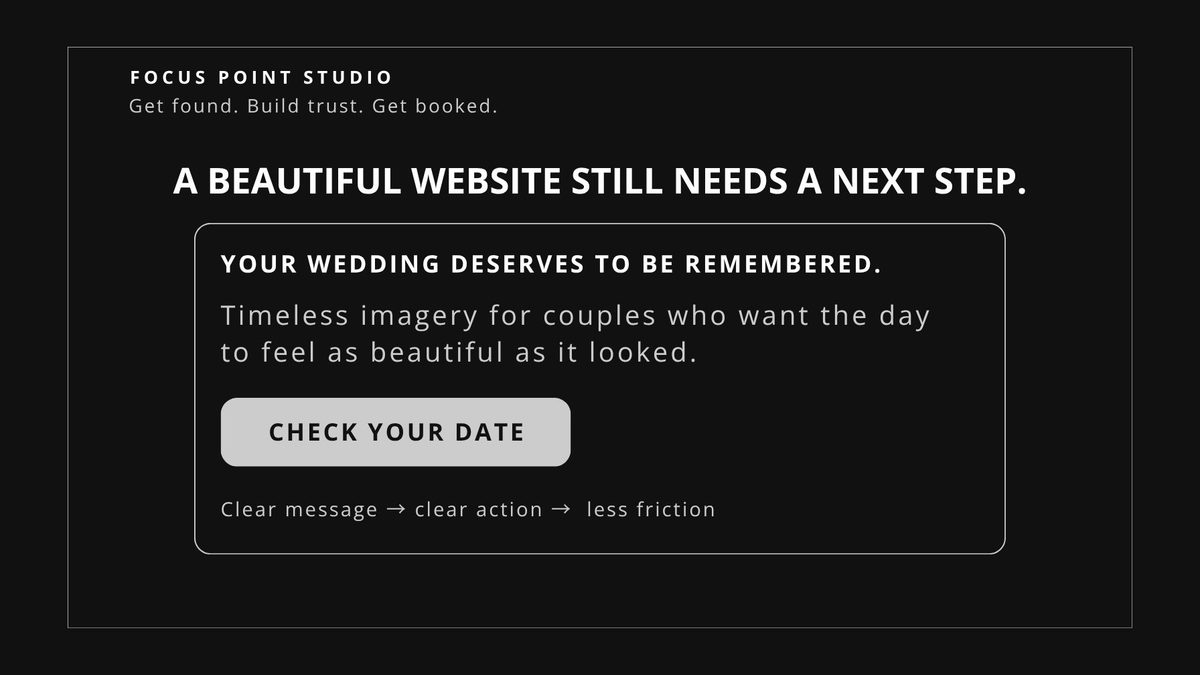
If a potential client finishes reading your site and they’re interested, what are they supposed to do?
Look at your site right now. Is the answer obvious? Is there a line of copy or a button that tells them exactly what to do next?
Most photographer websites have a contact page. But they don’t actively guide visitors toward it. The visitor has to decide on their own to go looking for it. That’s friction, and friction kills conversions.
Research from Smart Albums shows that clients want to know what type of photographer you are, your location, and how to contact you within seconds of landing on your site. If they can’t find that information fast, they leave. Source: Smart Albums
The fix: Put a clear, specific call to action on every major page. Not just “contact me” but something like “Check your date” or “Let’s talk about your wedding.” Tell them what happens when they click.
You’re missing trust signals
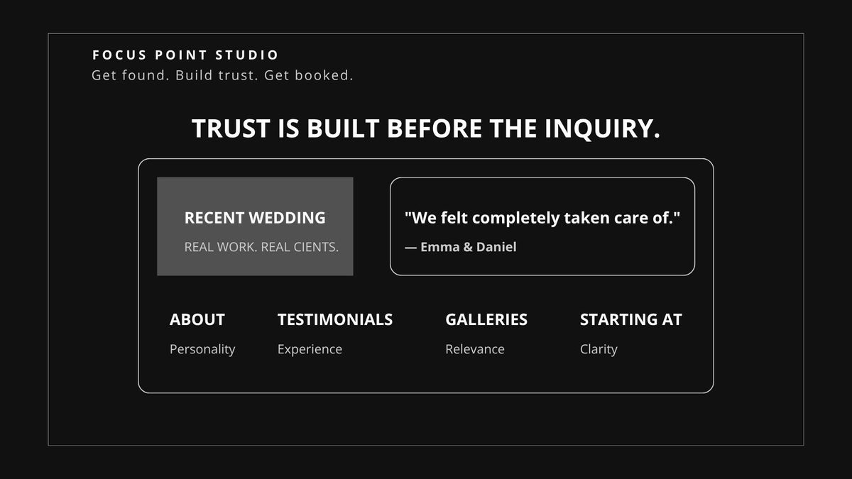
A potential client arriving at your website doesn’t know you. They’re deciding whether to trust a stranger with something that matters a great deal.
Trust signals are the elements that answer the question “Is this person right for me?” without the visitor having to ask. They include:
Testimonials from past clients written in their own words that describe the experience. A warm, genuine about page that shows the person behind the camera. Sample galleries organized by the type of shoot the client is considering. Real pricing information, or at least a starting range, so they’re not left guessing.
When these are missing, visitors leave without reaching out, not because they’re uninterested but because the site didn’t give them enough to feel confident.
The fix: Add at least three client testimonials to your homepage. Write an about page that covers your approach and what clients can expect, not just your credentials.
Your site wasn’t built for your specific client
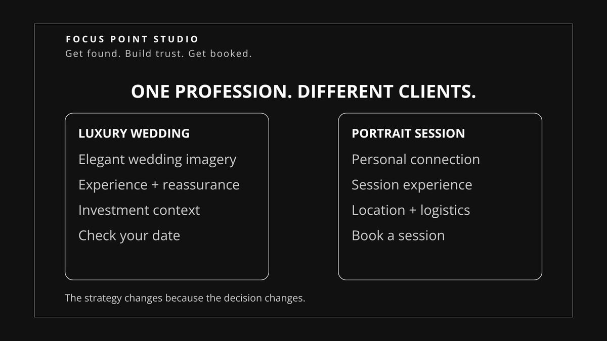
This is the most overlooked problem and the hardest to fix on your own.
Different clients make decisions differently. A couple planning a $30,000 wedding needs to see different things than someone booking a $400 portrait session. A brand founder has completely different concerns than a new parent looking for newborn photos.
Most photography websites are built generically. They’re designed to look good and present work, but not designed with any specific client in mind. The layout, the copy, the images selected, the calls to action; none of it is calibrated to the exact person who should be booking.
Food Photography Blog reviewed thousands of photographer websites and found one of the most common mistakes is showing the wrong work to the right clients. If a potential wedding client arrives and your gallery is full of portrait work, they leave without ever knowing you photograph weddings. Source: Food Photography Blog
The fix: Get specific. Decide who your ideal client is. Build separate pages or sections for each service. Write the copy on each one to speak to that specific client.
Want to audit your own site? Download our free Website Checklist for Photographers.
Your backend doesn’t support your frontend
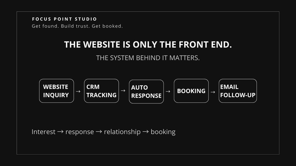
A client visits your website, gets excited, fills out your contact form, and then what?
If form submissions go to a general inbox and you respond whenever you get a chance, you’re losing bookings. Clients in booking mode are often reaching out to three to five photographers at the same time. The first to respond with a clear, professional follow-up usually wins.
A website can generate interest, but if the system behind it doesn’t handle that interest properly, you’re still leaving opportunities on the table.
A booking system connected to an automatic response, a CRM that tracks every inquiry, and an email platform that nurtures leads who aren’t ready to commit yet can turn the website from a static portfolio into part of your sales process.
The fix: Connect your inquiry form to an automated response. At minimum, send an immediate confirmation when someone reaches out, with next steps clearly outlined.
The real fix
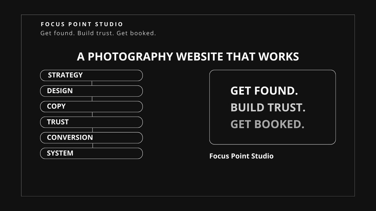
Every issue above comes back to the same root problem. The website was built to look good, not to perform.
Photographers who consistently attract their ideal clients tend to have something important in common: their website was built with a strategy. A deliberate decision about who the site is for, what that person needs to see, how to earn their trust, and how to move them toward booking.
Not ready for a redesign? Start with our free 5-point Website Checklist for Photographers and see which issues are holding your website back. Get the Free Checklist
Ready to build a website around your business? Work with us at Focus Point Studio.